
Design systems are misunderstood. When most folks think of design systems things that come to mind include design principles, component library, accessibility specs, color palettes, or a Figma file that contains all the individual components of a product (UI kit). At times, the debate of which comes first ensues, leaving teams stuck in a state of bikeshedding.
In her book “Design systems—A practical guide for creating design languages for digital products” Alla Kholmatova defines design systems as “A set of connected patterns and shared practices, coherently organized to serve the purposes of a digital product.”. Though in theory, the definition is ideal, in practice things tend to get lost in translation due to individuals assuming a living Figma document(UI kit) that contains all components of a digital product—a static articulation void of code—is a design system.
Three elements that define a product are development/engineering, business/product, and design (commonly known as EPD structure). The former VP of Design for Airbnb, Alex Schleifer referred to it as the three-legged stool. Aligning all three (EPD)during product development—at the start, through to the end— leads to a well-rounded product build practice that ensures all pieces are considered, achieving a well-balanced system where all disciplines are contributing their expertise at the highest level.
Without the EPD structure baked in from the start of product development, an imbalance where an ingredient from a specific discipline is missing can lead to a suboptimal product.
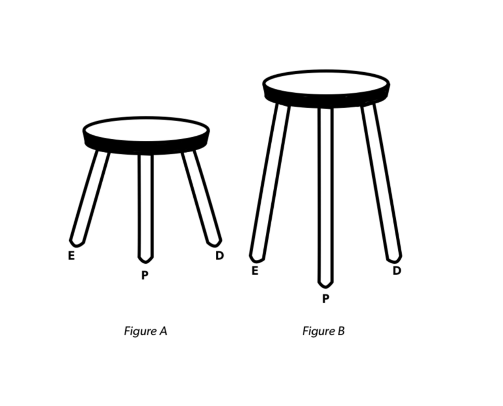
A well-built stool when all three disciplines are considered from the start. 
Nonfunctional stools when a discipline (Design) isn’t considered from the start.
A design system aims to help reconcile imbalances. Though a design system includes a UI kit, that is not what it’s strictly composed of. A design system also includes a component library which is the code equivalent to a UI kit in Figma.
A few other ingredients that make up a design system include guidelines which are principles, constraints, and rules that keep the design system balanced. A reference site (also called a style guide site, or documentation site) a live site that houses the design system, and is accessible by all.
The digital product is an actualized rendition of a design system that articulates how all the components fit together. Though it is a rendition of a design system, the digital product is typically a precursor to the design system, or things are baked in tandem. Once a design system is created—typically during creation of a product—it’s then potentially applicable to subsequent product builds.
An additional flavor being introduced to design systems are design tokens which are fundamental components like color, font width that can act as an abstract—though central to a design system—over a core design system, switching out atomic-level dynamics while retaining the makeup above. In instances where multiple brands share one design system, or a brand refresh occurs, design tokens make updating fundamental ingredients like color, type, and spacing across varying areas more simple.
Here’s a great representation of the makeup of a design system.

The components library sits at the center of a design system. It’s the manifestation of all the ingredients providing the digital product, and reference site with live components. Design tokens live as an abstract on the component library depending on core styling needs. Guidelines and UI kit both inform and support. All these items are interconnected, and that’s what makes it a design system. An update within the component library cascades across all areas it’s being consumed.
So, what is a design system?
Comments
One response to “Clarifying Design Systems”
[…] Clarifying Design Systems, and shared it on […]